
Padres City Connect 2.0 shows how regional identity can sharpen cap design
The San Diego Padres unveiled City Connect 2.0 on April 9, 2026. For cap buyers, the launch is a useful case on color control, cultural patch logic, and cleaner storytelling in a retail-ready cap program.
San Diego Padres City Connect 2.0 is worth watching because it shows that regional storytelling does not have to become visual overload. A cap can feel more premium when the base palette stays controlled, the front mark stays readable, and deeper cultural meaning moves into a secondary patch or symbol. For buyers planning custom baseball caps, bilingual capsules, or region-led drops, that is a practical product lesson instead of just a sports headline.
What happened in the Padres City Connect 2.0 launch
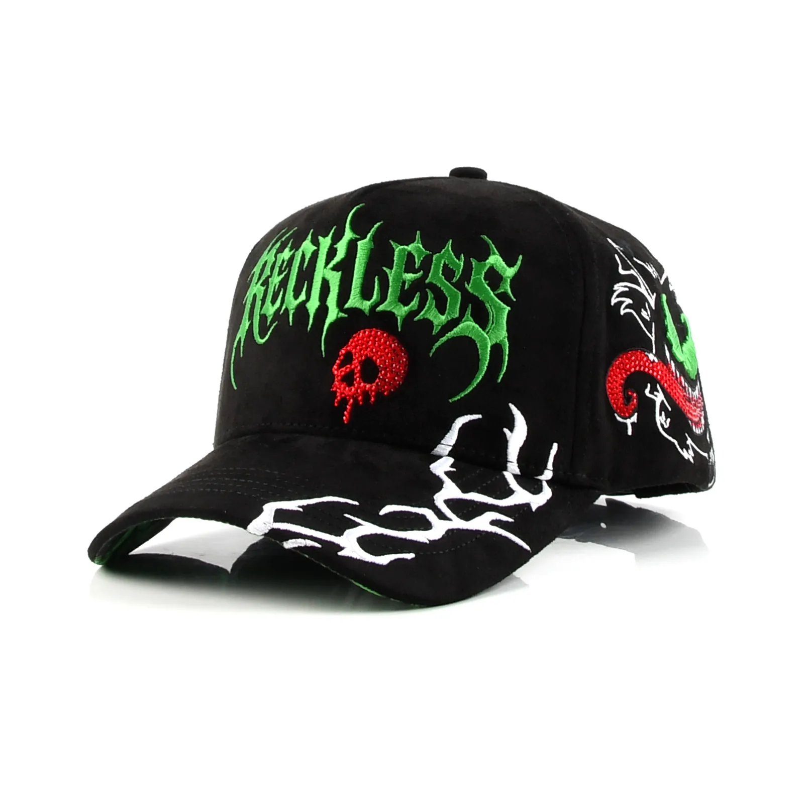
According to the Padres' official April 9, 2026 release, City Connect 2.0 continues the club's binational Southern California and Mexico story but presents it through a darker and more controlled look. MLB's same-day coverage adds the cap-level detail buyers care about most: a bone crown, an obsidian bill, and an interlocking SD mark using marigold and obsidian.
SportsLogos' design breakdown helps explain why the update works. The launch does not spread its cultural signals across every visible surface. Instead, it lets the main cap body stay readable while pushing deeper symbolism into secondary graphic elements and patches.
Why cap buyers should pay attention
The strongest signal here is not simply that bright cultural references still sell. The stronger signal is that cultural storytelling works better when each design layer has a clear job. The front logo handles recognition, the cultural patch carries deeper meaning, and the accent colors support the story without taking over the cap.
Quick take: Do not copy the Mexican references directly. Copy the design hierarchy: hero logo first, cultural patch second, accent color third.
For OEM, ODM, and private-label teams, that is a more usable lesson than imitating a licensed sports cap. Value often comes from cleaner structure, not from adding more motifs.
What this changes for development and sourcing
Caps built around local identity need tighter hierarchy during sampling. The hero mark has to stay embroidery-friendly. The secondary patch can carry more narrative weight. Accent colors should be tested as emphasis, not as the entire body. If all three layers compete at once, the cap usually becomes noisy instead of memorable.
That changes the sample sequence. Teams should lock the base color ratio first, then test front-logo stitch clarity, patch readability, and edge finish. This is a better route than trying to force every cultural cue into one early sample.
| Design layer | Padres signal | Buyer takeaway |
|---|---|---|
| Base palette | Bone and obsidian calm the system | Start from a controlled foundation |
| Front logo | Interlocking SD stays readable | Keep the hero mark embroidery-safe |
| Cultural patch | Deeper symbolism sits in a secondary placement | Put complex storytelling in one focused area |
| Accent color | Marigold and aqua stay supportive | Use bright color as emphasis, not the whole cap |
What brands should do next
The right response is not to copy an MLB cap. It is to review whether your next regional, festival, or bilingual capsule needs a cleaner split between hero logo, cultural patch, and support color. That usually leads to stronger retail storytelling and cleaner samples.
If the next step is organizing a new cap program, start with what to prepare before sampling. If development is already underway, the better follow-up is how custom hat sampling works.